
Jumpie - friendly travel planner
Jumpie is a mobile travel planner app designed to make trip planning less overwhelming and more collaborative.
Project Overview
Jumpie is a mobile travel planner app designed to make trip planning less overwhelming and more collaborative. Instead of juggling notes, screenshots, and chat messages, Jumpie lets you organize trips in one place and share them with friends.
The goal of this project was to design a beginner-friendly experience where users can quickly create or reuse travel templates, keep track of changing plans, and store memories in a shared trip album.
Role
UX/UI Designer
Duration
1–2 weeks
Tools
Figma
Team
Individual project
Methods
UX Research, wireframing, prototyping, feedback rounds
Problem
Many people plan trips across multiple apps (notes, maps, chat, galleries), which makes it hard to keep everyone updated when plans change and to keep memories organized after the trip.
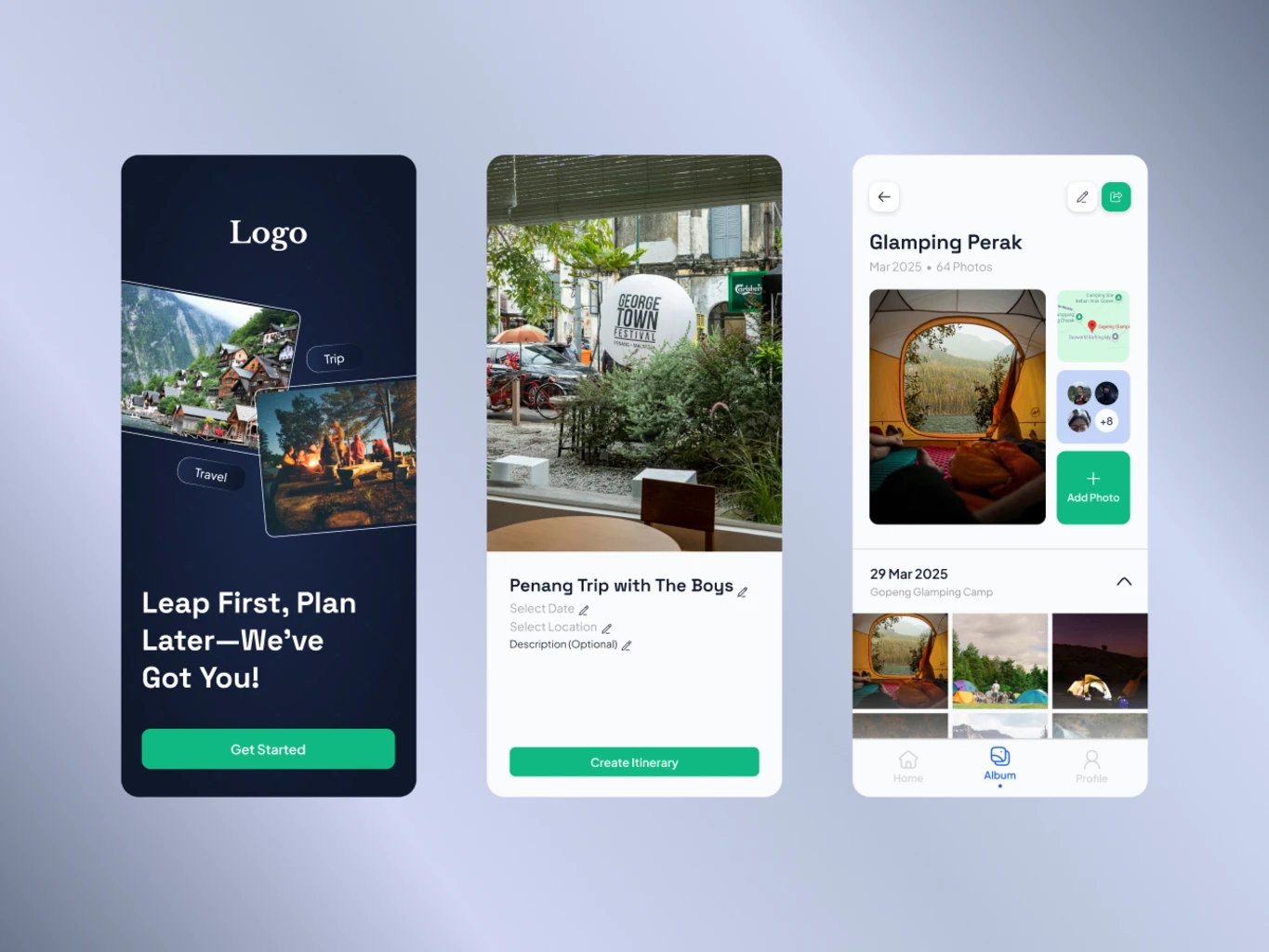
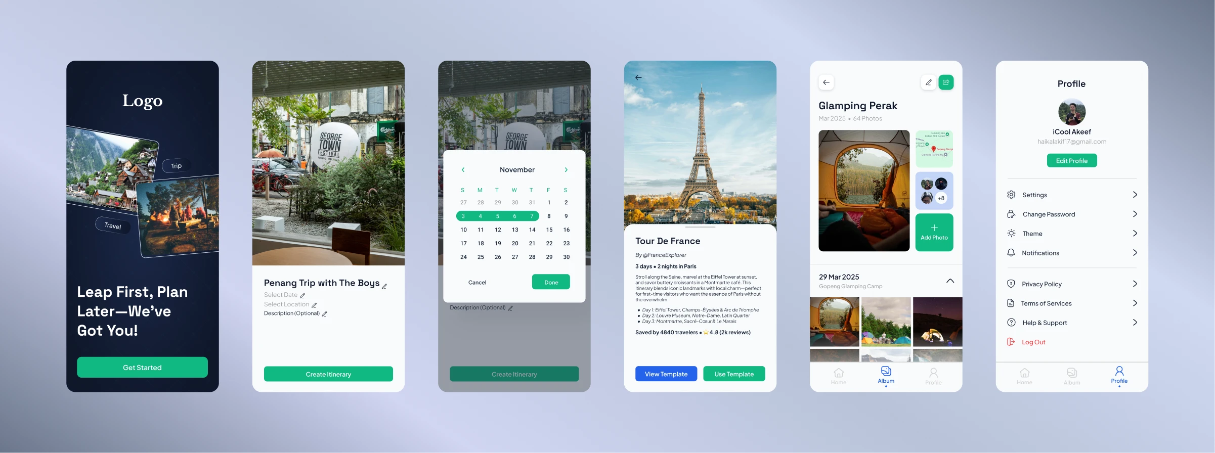
Final Designs
Six core interfaces from Jumpie that show how planning, templates, collaboration, and memories come together.
Highlights
- Splash Screen: A simple, friendly welcome screen that introduces Jumpie and sets a calm, travel-focused tone.
- Travel Plan Creation Page: A focused layout where users can name their trip, set dates, choose a destination and start building the plan structure.
- Date Selection Popup: A compact date picker that makes it easy to adjust start and end dates without losing context of the current screen.
- Public Template Page: A browseable view of reusable travel templates that users can clone and customize for their own trips.
- Album Page: A shared photo space where friends can upload and view pictures from the trip, grouped by day and moment.
- Profile Settings Page: A simple settings screen where users can manage basic profile details, preferences and notification options.
UX Design Process
a. Research
Goal: Understand how people currently plan trips with friends and where coordination breaks down.
- Most users spread their trip planning across messaging apps, notes, and spreadsheets.
- People like starting from existing itineraries to save time, then tweaking details to fit their own trip.
- It is easy to lose track of updates when plans change in group chats, especially for timing and meeting points.
- Photos from the trip are often scattered across different chats and devices, making it harder to look back together.
These findings pushed me to focus Jumpie on three pillars: clear trip structure, easy reuse of templates, and a shared space for memories.
b. User Flow
I designed a short flow where users can start from “New Trip” or “Use Template”, quickly add dates, destinations, and activities, then invite friends to view and follow updates.
c. Wireframes
In low-fidelity wireframes, I focused on making each day of the trip feel like a vertical stack of cards (transport, activities, notes). This made it visually easy to scan and reorder items if the schedule changed.
d. Prototype
Using Figma, I built an interactive prototype connecting the home screen, trip planner, activity details, and shared album. I paid attention to navigation so users could always jump back to the main trip overview.
e. Testing & Iteration
- "The splash screen feels friendly and not too busy – it gives a clear first impression of what the app does."
- "The travel plan creation page makes it obvious what I need to fill in to get started."
- "The date selection popup is small but clear – I can adjust dates without feeling lost."
- "The public template page is helpful when I don't know where to start – I like being able to reuse a full plan."
- "The album view makes it easy to scroll through photos from each day of the trip in one place."
- "Profile settings are simple and not overwhelming – I can quickly change details without digging through too many options."
After feedback, I refined the empty states on the creation and template screens, clarified selected dates in the popup, added small labels in the album for each day, and grouped less important profile settings under expandable sections.
Impact
- The six core screens gave testers a clear mental model of how to move from first impression (splash) to planning, choosing dates, reusing templates, sharing photos and managing their profile.
- The public template and travel plan creation screens reduced the time it took testers to set up a basic trip compared to starting from scratch in notes apps.
- The album screen helped testers feel that memories and plans belonged together, instead of being split across chat and gallery apps.
- Small improvements to the date popup and profile settings made testers comment that the app felt “simple but thoughtful” rather than overwhelming.
Learnings
This project helped me understand how structure and collaboration need to work together in travel planning. I learned that:
- People value tools that adapt to their existing planning habits instead of forcing a completely new way of working.
- Small details like clear dates, times, and labels significantly reduce confusion in multi-day plans.
- Combining planning and memory-keeping in one place can make a product feel more emotional and long-lasting.
If I continue...
If I continue developing Jumpie, I would explore features like offline mode, budget tracking, and smarter suggestions based on previous trips or templates.